
T-Charts can be used for a variety of purposes including comparing two or more different products, planning events, tracking progress, and more.
If you use Google Docs as your main document editing tool, you might be wondering – is it possible to create a T-Chart on Google Docs?
Well like other simple charts, yes, it is possible to create a T-Chart in Google Docs although it can be quite tricky especially if you’re doing it for the first time since there is currently no straightforward way to insert this chart directly into your document on the word processing platform.
If you’re currently searching for a way to create a T-Chart directly on Google Docs, you’re on the right page. In this article, we will show you how to create a simple T-Chart in Google Docs in a few easy and quick steps.
By the end of this article, we believe that you should be able to create your own T-Charts on Google Docs like a pro. So without wasting any more time, let’s get started!
Creating A Google Docs T-Chart: Quick Steps
- Create a new document on Google Docs.
- Insert a 2×2 table.
- Center align all cells on the table.
- Input both headings.
- Make the borders of the table slightly thicker.
- Remove all outer borders of the table.
- Input your content into the T-Chart.
How To Make A T-Chart In Google Docs (Step-By-Step Guide)
T-Charts are very simple-looking charts but can seem quite challenging to achieve especially if you’re quite new to Google Docs. This is because you cannot directly insert a T-Chart into your document on the platform.
To make a T-Chart on Google Docs, you will have to first insert a 2×2 table into your document, input a heading for each column on the top rows then remove all outer borders of the table.
Here is a detailed step-by-step guide showing how you can easily create a T-Chart in Google Docs.
Step 1: Create a new document on Google Docs.
First, go to the Google Docs dashboard then hover your mouse cursor over the “+” floating button and click the button when you see the pen icon to create a new Google document.
If you want to insert the T-Chart on an existing document on Google Docs, that should also work just fine, but make sure all existing text formatting has been cleared in the area where you want to create the chart before moving forward
Step 2: Insert a 2×2 table into your document.
Next, since we will be creating the T-Chart from a table, you will need to insert a simple 2×2 table into the document.
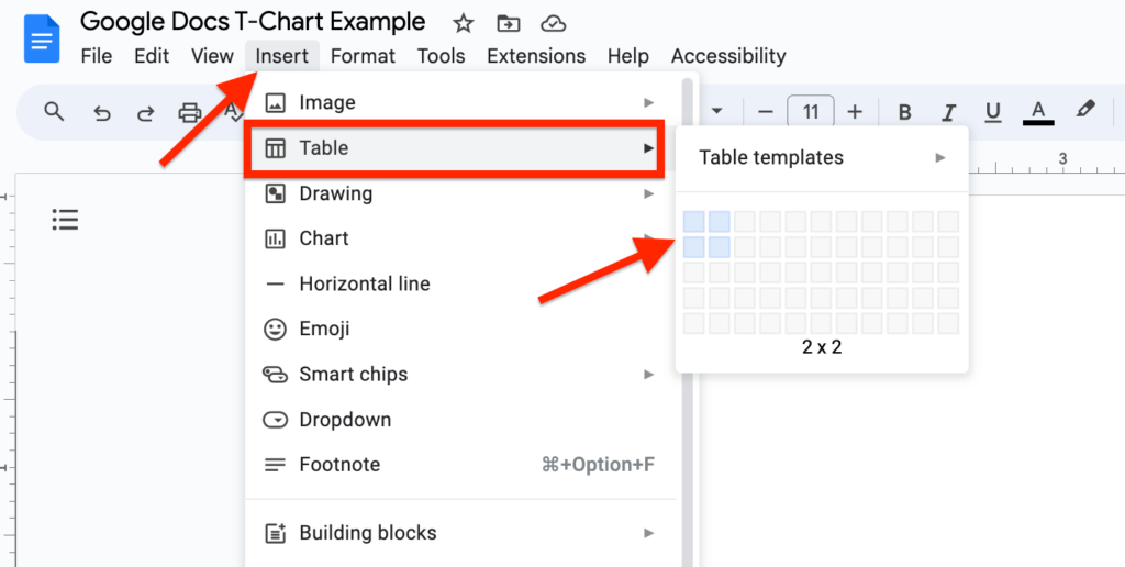
To insert a 2×2 table into your document go to the Google Docs menu bar and click “Insert” > “Table” then use your mouse to select a 2×2 table as shown in the screenshot below.
Step 3: Center align the table.
When the table is inserted, select all cells on the table using your move cursor, go to the toolbar, and click on the alignment selector, then select the “Center align” option.
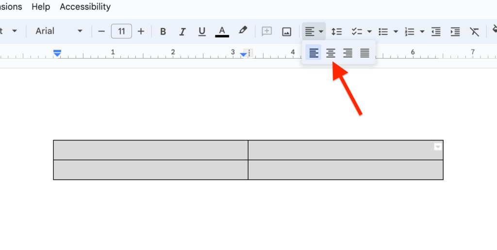
This will ensure all texts on each cell on the table are aligned both center vertically and horizontally which is exactly what we want for a T-Chart.
Step 4: Input headings for each column on the table.
Now, the next step will be to input the heading of each column of the table (and eventually, T-Chart) in the top rows of the table.
To do this, just place your text cursor in the first row on the top and enter the heading you want to use for the first column.
Repeat the step for the second column, then slightly increase the font size of each heading and make both headings bolder until you have something similar to what we have below.

Step 5: Make all borders of the table thicker.
Next, you will need to make all borders of the table slightly thicker. Although this is an optional step, for a T-Chart, we recommend making all borders thick.
To thicken the borders of the table, right-click anywhere inside the table then select “Table properties” from the menu options.
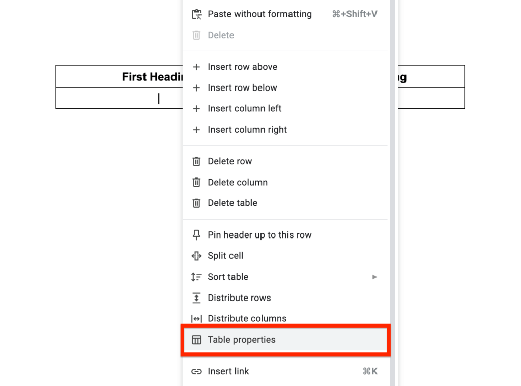
Now, you should see the Table Properties side panel on the right-hand side of the Google Docs window.
Scroll down and expand the “Color” section then increase the “Table border” from “1pt” to “1.5pt” or any other value depending on your preferences.
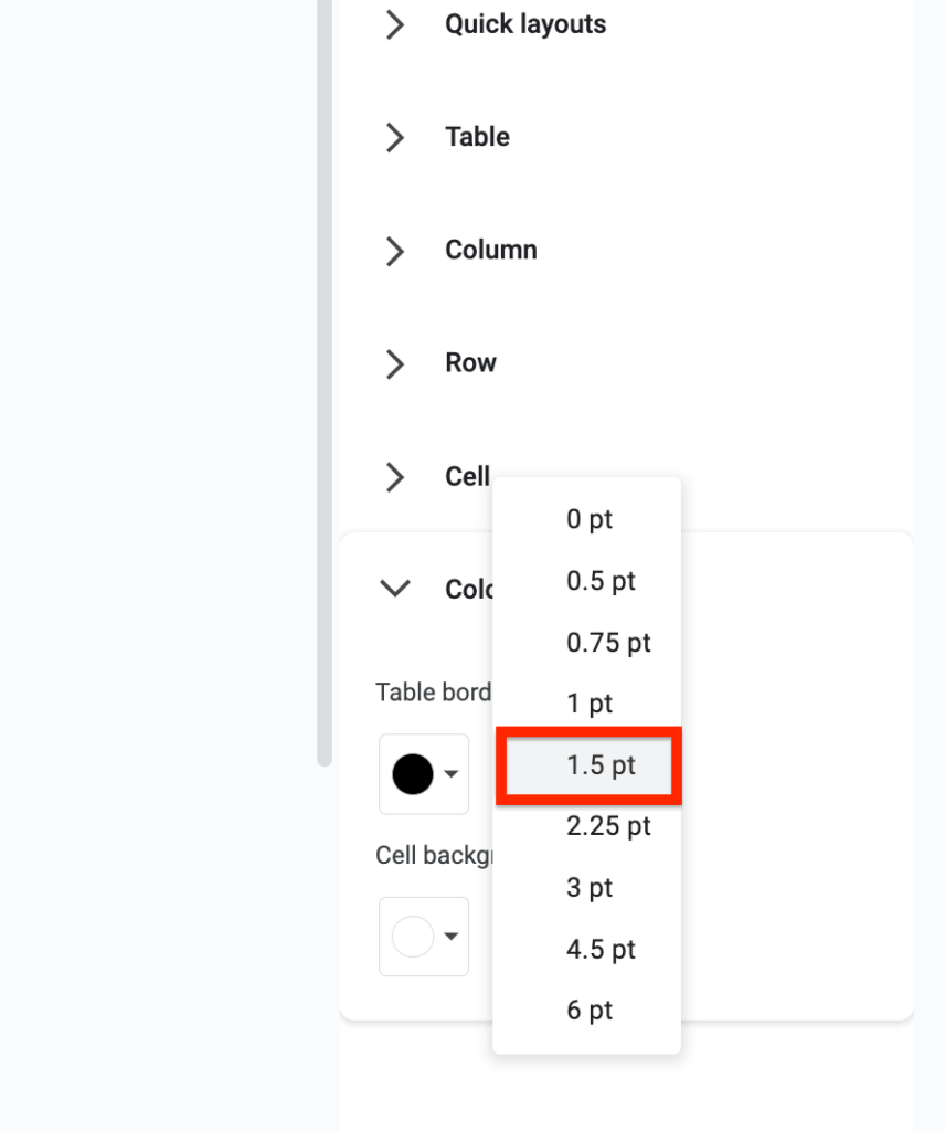
After increasing the border weight, you should now see that all borders on the table are slightly thicker which is exactly what we wanted to achieve.
Step 6: Remove all the outer borders.
To get the “T” shape for our T-Chart, we will have to remove all the outer borders of the table so that the remaining inner borders will form a nice T shape for the chart.
There is currently no way to remove all the outer borders of a table at once on Google Docs so you will have to do this manually with all the outer borders.
To remove an outer border, click on the border then go to the Google Docs toolbar, click on the “Border width” icon then select “0pt” to get rid of the border.
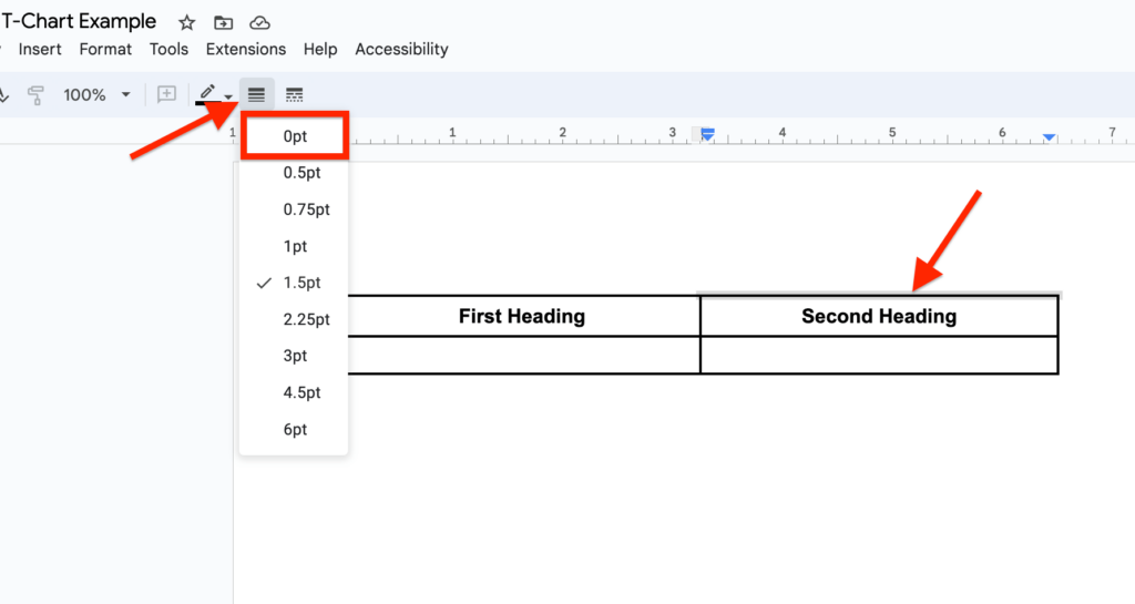
Repeat this step for all the remaining 7 outer borders on the table.
If you want to do this faster, simply hold down the shift key on your keyboard then use your mouse cursor to select all the borders one by one and change the border width to “0pt” as explained earlier.
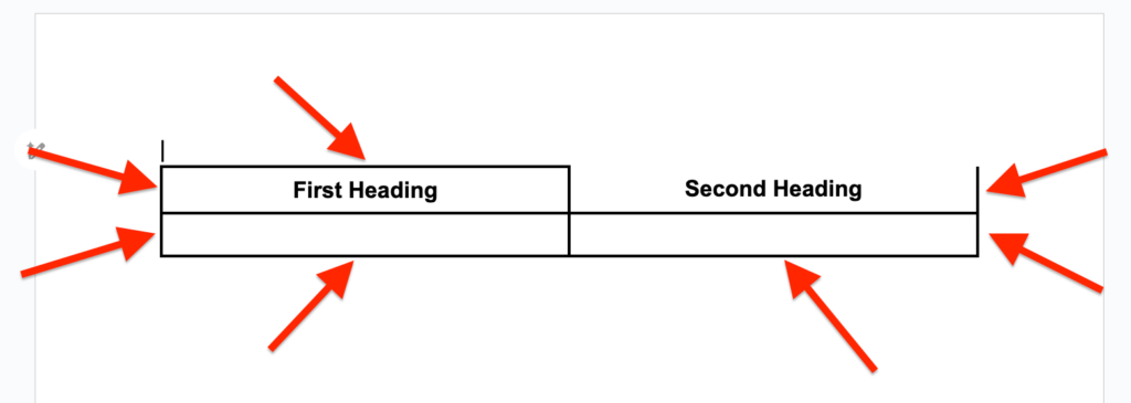
After removing all the outer borders, you should now have a simple T-Chart like we have in the screenshot below.
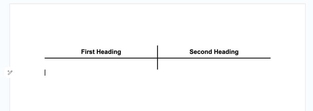
Step 7: Insert content into the T-Chart.
Finally, you will need to insert content into the T-Chart. Since the T-Chart is technically a table, you can simply enter content into the cells.
The table should auto-adjust its height anytime you tap the return/Enter key on your keyboard so you don’t really need to adjust the height of the T-Chart before typing in the content you’re trying to compare.
Here is what our T-Chart looks like after entering content into the chart.
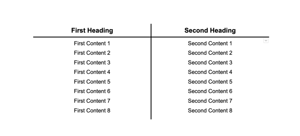
Is There A T-Chart Template For Google Docs?
Making a T-Chart is quite easy and only takes a couple of minutes to create a simple one on Google Docs but if you’re running out of time, you can simply use a free Google Docs T-Chart template to complete your work ASAP.
Here is a link to the T-Chart we created in this article.
To use this free Google Docs T-Chart template, open the link on a new tab on your browser then click “File” > “Make a copy” and Google Docs will make an editable copy of the template.
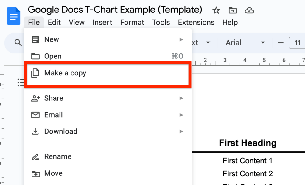
From there, you can copy the T-Chart, paste it into your document, and edit the content on the chart as you want.
Wrapping Up
T-Charts are very helpful graphical comparison tools that can be used to differentiate between two different sets of data.
On Google Docs, there is no way to insert a T-Chart directly into your document instead you will need to utilize a simple 2×2 table to form a T-Chart.
In this article, we have discussed the steps involved in making a T-Chart in Google Docs. These steps include inserting a 2×2 table, inputting headings, making borders thicker, removing the outer borders, and finally adding content to the chart.
And that will be it for this article. If you landed on this page because you were searching for a way to insert a simple-looking T-Chart in Google Docs, we hope found this article helpful.